Brand Building: Signature Collection by KVK / 【品牌塑造】 冠環球 王牌系列
From heritage to innovation—reframing Hong Kong and Macao jerky as a premium, cultural gift
Signature Collection by KVK is a premium sub-brand launched in 2024 by Kun Van Kau, a heritage Hong Kong-Macao jerky house with a century of family legacy. The project set out to redefine jerky’s place in the snack and gifting landscape, positioning it as a cultural craft worthy of contemporary appreciation.
As a third-generation member of the founding family, I led the brand’s development from the ground up—from naming and language, to visual concept, packaging tone, retail experience, social voice, and bilingual cultural storytelling.
傳承與創新並行,將港澳風味肉乾昇華作文化精品
「王牌系列」乃 港澳百年肉乾老號 冠環球 於 2024 年創立的子品牌,冀為家族企業營造煥然一新形象。項目旨在重塑肉乾於本地與零食、禮品市場中的角色,透過品牌策略、產品設計與零售體驗,讓這種源自庶民文化的食物,以精品化姿態重新進入大眾與年輕世代視野。
本人榮幸以家族第三代一員之身分,主導品牌由零開始的構造,包括品牌命名、核心語言、視覺概念、包裝語境、店舖體驗、社交媒體語調,以至文化敘事內容的撰寫與策展。
About
A family saga tracing back a century.
Mr Kwok Tong, from his early days in Canton and Hong Kong, learnt the ancient art of jerky making under famed shop Yue Yuen. Post-WWII, he pushed his cart through the streets of Hong Kong, crafting jerky over charcoal at home. Over the years, he established shops across Hong Kong and Macao, gradually giving rise to Kun Van Kau / Koon Wan Kau.
As time passed, nurtured by the Kwok family, Kun Van Kau flourished, gaining renown across Hong Kong, Macao, and beyond. The creed ‘Gourmets Know It’ has continued through three generations, with the brand’s reputation as a jerky and snack master enduring across time.
Today, the Signature Collection by KVK is crafted as a tribute to innovation and heritage, marking a new chapter for this family business.
關於
悠久的家族故事,要追溯到百年前。
郭棠先生自小赴穗、在港學藝。師承名店愉園的他,通曉肉乾製作古藝。二戰後於街頭推車營生,工餘時在家架炭燒製肉乾,日積月累於港澳兩地設店,「冠環球」悄然誕生。
歲月流轉,「冠環球」在郭氏家族代代呵護下聲名遠播,「聞香下馬,知味者來」的信念已傳承三代,成就肉乾與零食大王的美譽。
如今,「王牌系列」結合創新與傳承,為家族品牌展開嶄新篇章。
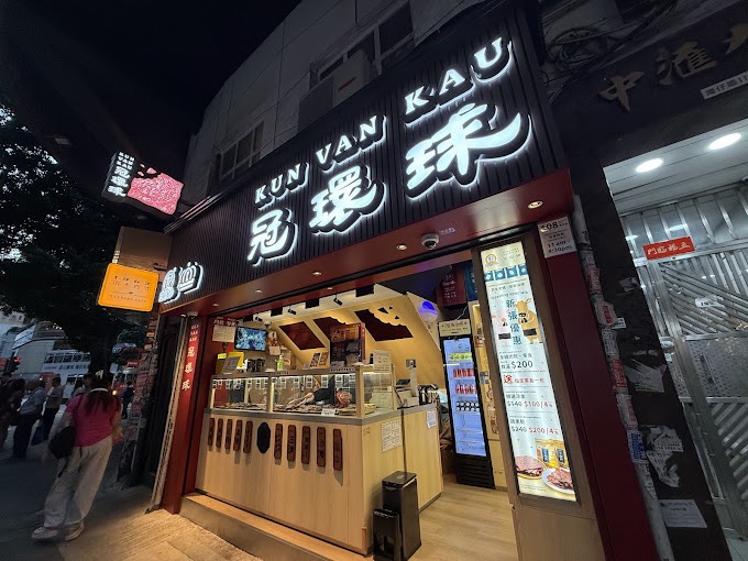
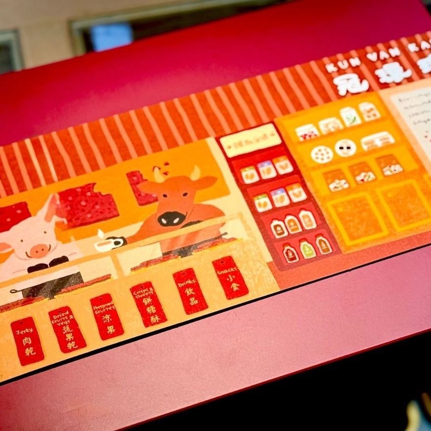
Retail experience and spatial design
The Signature Collection store is located on Wan Chai Road. Its traditional yet minimalist storefront is accented with jerky-patterned light boxes. The interior features wood flooring, light wood shelving, and clear-glass displays, topped with a reflective loft ceiling inspired by the texture of caramelised jerky—creating a space where nostalgia and modernity meet.
The spatial journey follows a ‘browse, taste, and purchase’ model, inviting customers to engage through the senses first, then discover brand stories and product heritage. A central tasting zone encourages casual interaction, while wall-mounted visuals outline the craft narrative and family legacy.
空間體驗與零售設計
王牌系列 門市選址香港灣仔道。以傳統簡約風門面招牌,配以仿真肉乾紋理燈箱點綴;內裝以木紋地板、淺木展架與通透玻璃展示,搭配耀目斜頂仿肉乾鏡面點題裝置,營造懷舊與現代共存的空間感。
動線設計以「閱覽、試味、選購」為主軸,讓顧客能先從味覺切入,再延伸至品牌與文化故事。試味區設於中央開放位置,營造親切參與感;牆面圖文介紹則同步提供產品背景與家族歷史。
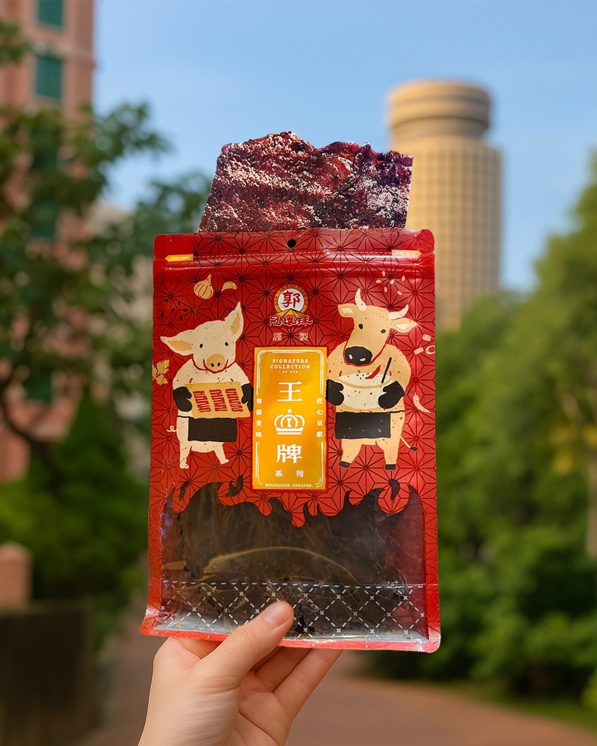
Brand language and packaging strategy
Signature Collection blends traditional butcher terminology with modern, intuitive phrasing—using names like ‘Sweet’, ‘Coins’, and ‘Whole Cut’ that resonate with both heritage and contemporary speech. All labels and copy are presented bilingually, maintaining clarity and cultural relevance for both local and tourist-facing markets.
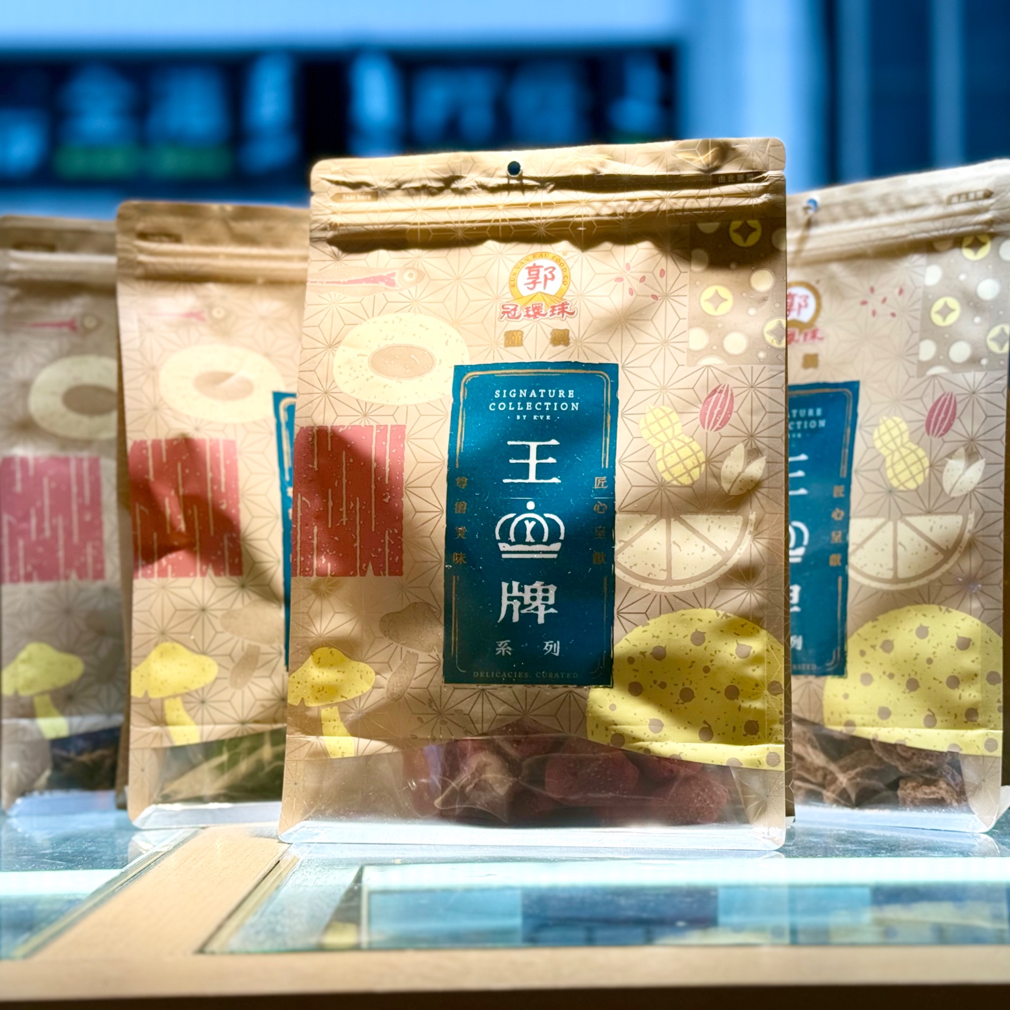
The jerky series features animal forms paired with artisanal silhouettes—projecting craftsmanship with a playful human touch. The snack lines distil key ingredients into stamp-like motifs, arranged in rich, layered layouts. Across all three series, packaging adopts a distinctive plaque-style structure, accented with gold-foil textures, proprietary logotype, and the signature ‘K’ crowned monogram, offering both visual coherence and tactile elegance.
品牌語言與包裝設計語境
「王牌系列」糅合祖輩傳統習慣與當代語感,產品命名沿用「蜜味」、「金錢」、「原切」等貼地詞彙,既傳承行內術語,亦切合現代口語直觀。標籤與文案皆以中英雙語呈現,確保無論是本地顧客或旅客,都能清晰理解產品特性,同時感受到文化底蘊。
肉乾包裝設計結合動物造型與職人輪廓,傳遞工藝感之餘不失親切趣味。兩款零食包裝則將代表食材轉化為圖章式視覺語言,形成節奏豐富的視覺編排。三款包裝均採用牌匾構圖,結合金箔紋理、品牌特製標準字與嵌入「K」字的皇冠標誌,建立鮮明辨識度與高級手感。
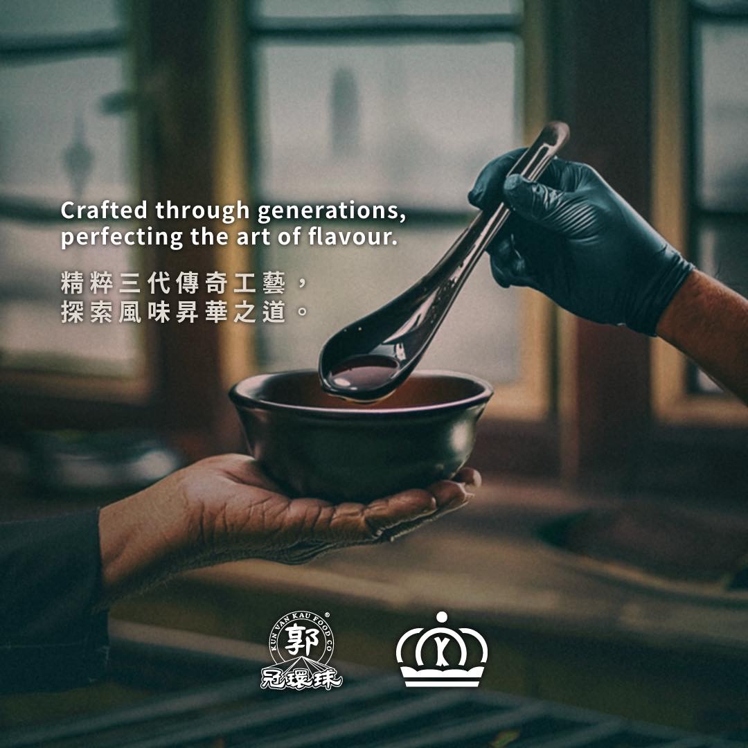
Social media and cultural narrative strategy
Our social content revolves around values, flavour, and time—curating journal-like bilingual posts that reflect seasonal, cultural, and material nuances.
社交媒體與文化敘事策略
品牌社交媒體內容以品牌價值與文化敘事為主軸,輔以時令節慶、食物製程與風味探索等主題,形成「品牌日誌」式連載。文風真誠、含蓄而不失溫度,突顯品牌對食材與手藝的敬意,亦強化顧客與品牌之間的文化連結。
E-commerce UX and language consistency
Our digital storefront mirrors the offline tone: product descriptions highlight taste profiles, ingredients, and origins, while preserving the brand voice. Packaging thumbnails and layouts follow the same visual system, ensuring recognition and continuity across platforms.
POS 體驗與選購流程設計
門市配備 iPad POS 系統及透明價籤模組,結合「品牌資訊/即場試味/選購下單」的導賞式購物體驗,並設有零散包裝試食及精裝禮盒展示。為突顯「肉乾不止是零食,也是品味選擇」,特別設計不同組合形式與價位層次,以滿足日常自用與送禮情境需求。
POS experience and purchase journey
The in-store point-of-sale system integrates product storytelling with an immersive tasting-to-purchase flow. iPad-enabled checkout and modular display units invite customers to explore at their own pace. Gift boxes and tasting packs are tiered across usage occasions—from casual snacking to premium gifting.
E-commerce 與品牌語境一致化
線上平台同步升級,於商品頁加入風味描述、原料標示、製程介紹與品牌溯源,確保與門市溝通語調一致。網站與社交內容風格連貫,兼顧購物便利與文化識讀。電商平台包裝圖示亦沿用線下設計邏輯,維持消費者對品牌辨識度與信任。
Community and relationship building
Our community strategy repositions a traditional brand for a new audience.
社羣經營與顧客關係
品牌經營策略強調「老字號 × 新社羣」,致力於以文化及感官體驗吸引都市年輕族羣與海外顧客。
If you’d like to know more about our packaging rationale, brand copy tone, creative direction, or storytelling strategies, feel free to get in touch.
如欲瞭解品牌包裝設計語境、文案取向、視覺指導或內容策展思維,歡迎再聯絡查詢。
Post a comment